What Are Common CRO Mistakes (And How to Fix Them)
February 17 , 2026
Right now, your website is probably leaving 20–50% of potential customers on the table. Not because your product isn’t good. Not because your traffic is low. It’s because of broken parts of your conversion system that most owners never catch.
Here’s what matters: fix these 12 common CRO mistakes and you’ll boost conversions without spending another dollar on ads. A conversion rate optimisation consultant will tell you the same thing. The money is already coming to your site, you’re just not capturing it.
This guide shows you exactly what’s broken, why it matters, and how to fix it in hours, not weeks. Think of it as your Ecommerce CRO Checklist for the next 90 days.
Quick Fixes You Can Do Today
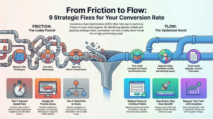
- Slow loading → Cut load time under 3 seconds (test on PageSpeed Insights right now)
- Mobile ignored → Redesign for thumb zones, not desktop-first
- Confusing navigation → Get people to their goal in 3 clicks max
- Weak CTAs → One clear action per page, benefit-focused copy
- No trust signals → Add real reviews where people hesitate
- Too many form fields → Reduce to 3–4 critical questions
- Testing blindly → Write a real hypothesis before you run anything
- Gut-feel decisions → Let analytics, not opinions, guide changes
- Bad test stats → Run proper sample sizes over full cycles
- One-size messaging → Segment mobile from desktop, new from returning
- Big redesigns → Test small changes, stack wins over time
- Ignoring micro-conversions → Track email signups, not just sales
Read on for the exact steps, proof, and tools that make each one work.
What Conversion Rate Optimization Actually Is (And Why It Matters)
Conversion rate optimization is the systematic process of increasing the percentage of visitors who take a desired action on your site. Email signup. Product purchase. Demo request. Whatever your goal is.
The math is simple: visitors × conversion rate = revenue.
Let’s say you get 10,000 visitors a month. At a 2% conversion rate (the average for e-commerce), you hit 200 sales. But push that to 4%? You’re at 400 sales. Same traffic. Doubled revenue.
The gap between “okay” and “great” is what separates a 2% site from an 8%+ site. And it has nothing to do with running more ads.
Why this matters for you: Most business owners focus on traffic generation. More Google Ads. More Facebook spend. More reach. But traffic is only half the equation. If your conversion rate is broken, buying more traffic is like trying to fill a bucket with a hole in the bottom. A conversion rate optimisation consultant knows this. They don’t start by telling you to spend more on ads. They start by stopping the leak.
Common CRO Mistakes (And How to Fix Them)
Mistake 1: Your Website Loads Too Slowly
Why It Kills Conversions
A one-second delay in page load time costs you 7% of conversions. Hit three seconds? Half your visitors leave.
This isn’t theoretical. KissMetrics found that 53% of mobile visitors bounce if a page takes longer than three seconds to load. Amazon learned that every 100ms of slowness cost them 1% in sales. Now multiply that across your entire business.
Slow sites aren’t just annoying. They’re expensive.
How to Spot It
Pull up your site on your phone right now. Does it feel instant? Or do you wait for images and text to appear?
Use Google PageSpeed Insights and GTmetrix. Both are free. Both show you exactly what’s dragging.
How to Fix It (4 Steps)
Step 1: Test and measure. Go to PageSpeed Insights. Enter your domain. Write down your mobile score. This is your baseline.
Step 2: Compress your images. Images are usually the heaviest files on a page. Use TinyPNG or Squoosh to compress them without losing quality. Better yet, switch to WebP format. You’ll save 25–35% file size immediately.
Step 3: Enable caching and use a CDN. Browser caching tells repeat visitors to use stored files instead of re-downloading everything. A Content Delivery Network (CDN) like Cloudflare serves your content from servers near your visitors. Together, these can cut load time by 30–50%.
Step 4: Remove unnecessary scripts. Every plugin, tracking pixel, and widget slows you down. Ask yourself: do you need this? If not, delete it.
Real Proof
A Shopify store tested speed improvements and saw a 3.9x gain in overall page speed. Sales followed. Faster pages meant more time on site, more clicks, more purchases.
Mistake 2: Treating Mobile as an Afterthought
Why It Matters Now
63% of e-commerce sales will come from mobile by 2028. Not might. Will. If your mobile experience is rough, you’re leaving money on the table every single day.
Mobile visitors don’t behave like desktop users. Their buttons need to be bigger. Their checkout needs to be faster. Their experience needs to respect their thumb, not their mouse.
Common Symptoms
Tiny buttons that are impossible to tap. A checkout process that requires pinching and scrolling. Forms that don’t auto-fill. A navigation menu that eats half the screen.
These aren’t minor annoyances. They’re conversion killers.
How to Fix It (4 Steps)
Step 1: Audit your mobile experience. Open your site on your phone. Go through the entire customer journey. Can you reach your goal in under 30 seconds without frustration? If not, there’s work to do.
Step 2: Design for thumb zones. People hold phones in their hands. Their thumbs reach the middle and bottom of the screen easily. Make important buttons and navigation live there, not at the top.
Step 3: Accelerate mobile pages. This goes back to speed. Mobile connections are slower than desktop. Prioritize what appears first. Lazy-load images below the fold.
Step 4: Test on real devices. Emulators lie. Use BrowserStack or a real phone in your hand. See what users actually experience.
Real Proof
A mobile-first redesign at a major retailer increased mobile conversion rates by 28% within six weeks. They didn’t change their product. They changed how people accessed it.
Mistake 3: Overly Complicated Navigation and UX
Why Complexity Kills Sales
Too many menu options create decision paralysis. Users don’t know where to click. So they click the back button instead.
Think about your top navigation. How many items does it have? If it’s more than five, you’re losing people.
How to Fix It (The Checklist)
Limit your top navigation to five items. That’s it. Everything else goes in a footer or secondary menu.
Create a clear hierarchy. What’s the most important action? Put it first. Make it obvious.
Add progress indicators on checkout. Tell people where they are. “Step 1 of 3” matters.
Remove distractions on key pages. On your checkout page, your goal is purchase. Navigation menu? Hide it. Chat widget? Disable it. Anything that doesn’t lead to purchase gets out of the way.
VWO tested this at a major retailer. They removed the entire top navigation from the checkout. Conversions jumped 100%.
One hundred percent.
How to Spot Where Users Get Stuck
Use Hotjar. Watch real recordings of people using your site. You’ll see exactly where they hesitate, click wrong buttons, or give up.
Mistake 4: Weak, Confusing, or Too Many Calls-to-Action
The CTA Conundrum
Your page has seven different buttons. “Learn More.” “Sign Up.” “Get Started.” “Download Now.” “Submit.” “Click Here.” Users don’t know which one to click, so they click none.
One strong CTA beats five weak ones every time.
How to Fix It (3 Steps)
Step 1: One primary CTA per page. That’s your button. That’s the only thing that really matters on this page.
Step 2: Use benefit-focused copy. Instead of “Submit,” say “Get My Free Quote.” Instead of “Sign Up,” say “Start My Free Trial.” Tell them what they get, not what they do.
Step 3: Make it stand out. Color, size, whitespace. Your CTA should be impossible to miss. Use a color that contrasts sharply with your background.
Test two versions. See which one wins. Usually the more benefit-focused copy wins.
Real Proof
A SaaS company tested two CTAs: “Start Free Trial” versus “Try It Now.” The benefit-focused version (Start Free Trial) converted 23% higher. Small change. Big impact.
Mistake 5: Missing or Poorly Placed Social Proof and Trust Signals
Why Trust Gaps Sink Sales
People don’t trust strangers. They trust other people like them who’ve already bought and lived to tell the tale.
A generic five-star review doesn’t move the needle. But a specific review from someone in your customer’s situation? That converts.
“Great product!” means nothing. “I was skeptical, but after using this for 30 days, my sales jumped 15%. Worth every penny.” That’s proof.
Where to Place Trust Signals (And Why It Works)
Above the fold on your homepage. First impression. Show authority immediately.
During browsing. As people scroll through your product pages, remind them that others like them bought this and won. A review counter. A recent purchase notification. Social proof in context.
At checkout. Right when someone’s about to spend money, hit them with proof. “Join 10,000+ satisfied customers.” A customer testimonial. Money-back guarantee badge.
Each placement works because it answers a question at that exact moment in the journey.
How to Collect and Display Reviews at Scale
Start simple. Ask customers to leave reviews after they purchase. Make it easy. One-click stars. One text box for comments.
Use Judge.me, Trustpilot, or a native Shopify widget. These tools automate collection and display.
Structure your reviews with rich data. Product name, rating, reviewer name, date. This helps search engines understand and display your proof.
Mistake 6: Too Much Friction in Forms and Checkout
The Abandonment Crisis
70% of shopping carts are abandoned. Most of them fail at checkout.
Why? Forms that ask too much. Too many fields. Forced registration. Confusing steps. A payment system that doesn’t work on mobile.
Every extra field you ask for increases abandonment. Research shows that removing just one field can increase completion by 5%.
How to Fix It (5 Changes)
Reduce required fields to 3–4. You don’t need phone number, company name, birthday, and favorite color. You need name, email, and address. That’s it.
Make guest checkout the default. Don’t force people to create an account. Let them buy as a guest. Offer an account after they’ve purchased.
Use real-time validation. Tell people immediately if an email is invalid or if a zip code doesn’t match. Don’t wait until they submit the whole form.
Go one-page if possible. Multi-step checkout feels long. One page feels quick. If you must use multiple steps, keep it to three max.
Auto-fill everything you can. Address lookup. Browser auto-fill for payment. Every keystroke saved is friction removed.
Real Proof
Shopify tested checkout optimizations across thousands of stores. The changes increased conversion rates by 5–36%. The stores that reduced fields, added guest checkout, and enabled auto-fill saw the biggest gains.
Mistake 7: Testing Without a Clear Hypothesis or Research
Why Random Tests Fail
Most teams run A/B tests and hope something wins. “Let’s try a red button instead of blue.” “What if we move the image up?”
Guess what? About one in seven tests wins without any research backing it. That’s chance. That’s not strategy.
A real hypothesis comes from data, not intuition.
Build Your Hypothesis Like This
“We believe changing [X] to [Y] for [audience] will increase [metric] by [Z] because [research insight].”
Example: “We believe reducing checkout fields from eight to four for mobile users will increase checkout completion rate by 8% because session recordings show 40% of mobile users abandon when they see the field count.”
That’s grounded. That’s testable. That’s smart.
Your Research Stack
Google Analytics: Show you where people drop off.
Heatmaps (Hotjar, Crazy Egg): Show you where people click, scroll, and hesitate.
Session recordings: Show you what people actually do and say (watch them test audio on, they often comment).
Surveys: Ask people why they didn’t convert.
All four together paint a complete picture. Don’t skip this step.
Mistake 8: Making Changes Based on Gut Feel or “Best Practices”
The Red Button Myth
Everyone says red buttons convert better than blue. It’s not true. Context matters. Industry matters. Your audience matters.
A hospital’s “Contact Us” button doesn’t need red. A fitness brand’s “Get Started” button might not either. But an e-commerce checkout button? Contrast matters.
The point: copy what works for someone else and you’ll get average results. Copy what works for your data and you’ll beat the market.
The Data-First Rule
Never launch a change without proof. Never.
Look at your analytics. Where are people getting stuck? That’s your friction point. That’s what you fix first.
Example: Your exit rate on the product page is 35%. That’s high. Why? Session recordings show people are confused about sizing. Add size guide. Test it. Launch only if it wins.
That’s data-first. That’s how pros work.
Mistake 9: Running A/B Tests Wrong (Sample Size, Timing, Stats)
The Statistical Traps
You run a test for two days. Variant B wins. You launch it. Then it loses.
What happened? You didn’t run it long enough. You didn’t reach statistical significance. You ran it on Wednesday when traffic patterns are different. You picked the wrong metric to measure.
These are common. They’re also costly.
The Correct Process (7 Steps)
Step 1: Set sample size first. Don’t guess. Use Evan Miller’s sample-size calculator (it’s free). Tell it your baseline conversion rate and the lift you want to detect. It tells you how many visitors you need.
Step 2: Run full cycles. Run your test for two full weeks minimum. Capture Monday through Sunday twice. Traffic patterns vary.
Step 3: Use Bayesian stats. Most tools default to frequentist stats. Bayesian is better for real-world testing. It updates probability as data comes in. Use VWO or Unbounce, both built on Bayesian logic.
Step 4: Track primary and guardrail metrics. Primary metric is what you’re trying to improve (conversion rate). Guardrail metrics are what you don’t want to break (revenue per visitor, bounce rate).
Step 5: Segment your results. Did the test win for desktop but lose on mobile? Different devices need different approaches.
Step 6: Check for statistical significance. You need 95% confidence minimum. Most tools show this automatically.
Step 7: Document everything. Hypothesis, results, winner, learnings. Build a testing library so you compound wins over time.
Tools That Do This Right
VWO handles all the stats automatically. Google Optimize is free but less reliable. Both work.
Mistake 10: Failing to Segment Your Audience
Why One-Size-Fits-All Fails
Your mobile user needs a different experience than your desktop user. A returning customer responds to different messaging than a first-time visitor.
Segment by mobile vs. desktop. New vs. returning. Traffic source. Location. Behavior.
Then optimize separately for each.
How to Segment and Act
Device: Mobile users want speed and simplicity. Desktop users can handle more information.
Source: Someone from Google search is different from someone from your email list. Email people already know you.
Behavior: Did they visit the pricing page? They’re considering. Did they abandon a cart? They’re close.
Location: Shipping costs matter to someone far away. Same-day pickup matters to someone local.
Returning visitors respond 2–3x better to trust badges than new visitors do. Why? Because returning visitors already almost trust you. A badge tips them over. New visitors still have doubts. A badge alone doesn’t cure that.
Real Proof
An online retailer segmented their email list and created different landing pages for repeat customers vs. new shoppers. Repeat customers saw trust signals. New shoppers saw product education. Conversion rate for repeat customers jumped 34%.
Mistake 11: Big Redesigns Without Testing
Why Full Redesigns Tank
You redesign your entire site. New colors. New layout. New copy. You launch it.
Conversions drop 20%.
Now what? You’ve broken 100 variables at once. You have no idea which one caused the drop.
Amazon doesn’t redesign. They test small changes, measure them, and stack them. Over years, the site looks completely different. But it got there through hundreds of tiny, tested wins.
The Iterative Approach
Pick one element. Test it. Measure it. If it wins, keep it. If it loses, kill it.
Then pick the next element.
Over 90 days, you make 12 small changes. Each one adds 3–5% lift. Together? They’re a 40%+ gain. And you never had a big scary redesign.
Mistake 12: Ignoring Micro-Conversions and Post-Purchase Experience
The 98% You’re Missing
Your focus is purchase. That’s the final conversion.
But what about everything before? Email signup. Add-to-cart. Wishlist addition. Video watch. Scroll depth. Download. Share.
These are micro-conversions. They matter because they predict purchases.
Someone who watches your product video is 40% more likely to buy than someone who doesn’t. Someone who adds something to their wishlist is considering it. These moments tell you who’s about to convert.
What to Track
Add-to-cart. Scroll depth (did they reach the bottom of your product page?). Email signup. PDF download. Video play. Time on page. Comparison clicks. Feature deep-dives.
Set up events in Google Analytics. Track them. Optimize them.
Why Post-Purchase Matters
Your customer just bought. That’s not the end. It’s the beginning.
A thank-you email. Shipping tracking. A follow-up asking how it’s going. An upsell recommendation. These interactions determine whether they buy again.
Research shows that 21% of your most loyal customers drive 44% of your total revenue.
Those loyal customers didn’t happen by accident. They happened because someone invested in the post-purchase experience.
How All These Mistakes Connect (The Complete Picture)
Here’s the truth: these mistakes don’t live in isolation.
Slow speed kills UX, which breaks trust. Confusing navigation increases friction, which kills conversions. Weak CTAs mean unclear goals, which means bad testing data.
Fix speed, and you fix user experience. Fix user experience, and you build trust. Build trust, and friction matters less. Reduce friction, and you get clean test data.
It’s a flywheel. Fix one, the others get easier.
Your 10-Minute CRO Audit Checklist
Answer yes or no to each. For every “no,” take the immediate action listed.
- Does your site load in under 3 seconds on mobile? No → Test on PageSpeed Insights today.
- Can you reach your main conversion goal in 3 clicks or fewer from the homepage? No → Map your user journey and simplify navigation.
- Do you have one clear primary CTA on each page? No → Pick one action per page and remove the rest.
- Is your checkout 3 steps or fewer? No → Combine or remove steps immediately.
- Do you display customer reviews or testimonials above the fold? No → Add your top review by tomorrow.
- Do you have fewer than 5 required fields in your main form? No → Delete unnecessary fields today.
- Have you recorded at least 10 user sessions this month? No → Set up Hotjar and watch users interact with your site.
- Do you write a hypothesis before every test? No → Use the formula provided in Mistake 7.
- Do you have traffic from at least three different sources (organic, paid, direct)? No → Diversify where people find you.
- Have you checked how returning visitors experience your site differently? No → Segment your analytics by new vs. returning users.
Best Free and Paid CRO Tools You Need
Analytics & Tracking Google Analytics (free) – Where visitors come from, where they drop off, which pages convert. Mixpanel (paid) – Deep user behavior tracking and cohort analysis.
Heatmaps & Session Recordings Hotjar (free and paid) – See where people click, scroll, and get stuck through heatmaps and recordings. Crazy Egg (paid) – Similar to Hotjar, good for visual feedback.
A/B Testing VWO (paid) – Full Bayesian testing platform with statistical guarantees. Google Optimize (free) – Basic testing built into Google Analytics. Evan Miller’s Sample Size Calculator (free) – Calculate the sample size you need.
Speed Testing Google PageSpeed Insights (free) – Mobile and desktop speed scores. GTmetrix (free) – Detailed waterfall charts and optimization suggestions.
Surveys & Feedback Typeform (free and paid) – Create surveys to ask why people didn’t convert. Qualaroo (paid) – Pop-up surveys triggered at specific moments.
Conversion Rate Optimization Consultation If you’re serious about this, a conversion rate optimisation consultant can audit your funnel and prioritize fixes based on impact. They’re worth the investment if your revenue is significant.
Build Your 90-Day CRO Roadmap
Month 1: Research Audit your analytics. Watch session recordings. Run a survey. Identify your top friction point. Document five hypotheses based on what you find.
Month 2: Hypothesis and Test Pick your highest-impact hypothesis. Run the test with proper sample size and length. Run 2–3 smaller tests on lower-friction areas in parallel.
Month 3: Analyze and Rollout Analyze your winners. Launch what won. Document learnings. Segment your audience. Run personalized versions for different groups. Measure the cumulative impact.
By month 4, you’ll have a baseline of what works. By month 6, you’ll have stacked enough wins to show a meaningful conversion increase. By year one, you could be 30–50% higher than where you started.
The Close: Your Conversion Lift Is Waiting
Stop guessing.
Pick one mistake from the list above. The one that feels closest to your situation. Apply the fix today. Give it 7–14 days. Measure what changes.
Your next 10–50% conversion lift isn’t hiding in a new ad campaign. It’s hiding in the sections you just scanned.
The traffic is already coming. They’re already interested. They’re already knocking on your door.
You just need to let them in.
Bookmark this page. Share it with your team. Use the Ecommerce CRO Checklist above as your quarterly audit. Make it a habit.
Your new CRO bible starts here.
Popular Post
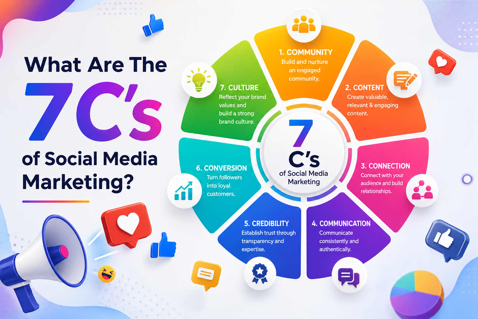
What Are The 7 Cs of Social Media Marketing?
The 7 Cs of Social Media Marketing are Content, Community, Conversation, Connection, Consistency, Credibility, and...

Google Removed FAQ Rich Results, But FAQs Still Help AI Find and Cite Your Website
Short Answer: Yes, FAQs Still Matter More Than Ever Google removed FAQ rich results. A...

How Social Proof and Trust Signals improves Conversion Rate
Social proof and trust signals work. Full stop. Products with just 5 reviews sell 270%...
